| CONTACTS |
Judie Brower |
| INFORMATION LINKS |
| Downloadable PDF of this release |
| WEB LINKS |
| View this release in your browser |
| NEWSROOM |
| Anthony Tesselaar Plants WEBSITE |
| DOWNLOADS |
Images
 |
 |

As we move into the dreary months of winter, it’s good to have something to look forward to in the spring. Each year at the beginning of Fall Fashion Week, the global color authority of the design industry, Pantone Color Institute, unveils its color palette trends and choices for the upcoming spring.
This year’s top 10 colors don’t have to be restricted to fashion though, especially because they were, in part, inspired by our natural surroundings.
"One of the things that we saw this year, was a renewed sense of imagination in which color was appearing in context that was different than the traditional," said Leatrice Eiseman, Executive Director of the Pantone Color Institute. "Reminiscent of the hues that surround us in nature, our Spring 2017 Fashion Color Report evokes a spectrum of emotion and feeling.” She goes on to say “they capture the promises, hope and transformation that we yearn for each spring."
This years’ palette of colors are definitely inspired by nature – from the fertile Kale green, bright Pink Yarrow and cheery Primrose Yellow to the aquatic tones of Island Paradise and Niagara. These trending colors can easily be added to any landscape, garden or patio or even rooftop planting.
Of course, it’s easy to find a variety greens throughout our landscape, but what plants can bring the other evocative colors to our garden décor? And how do we use it in our landscapes to their fullest? Here are just a few ideas.
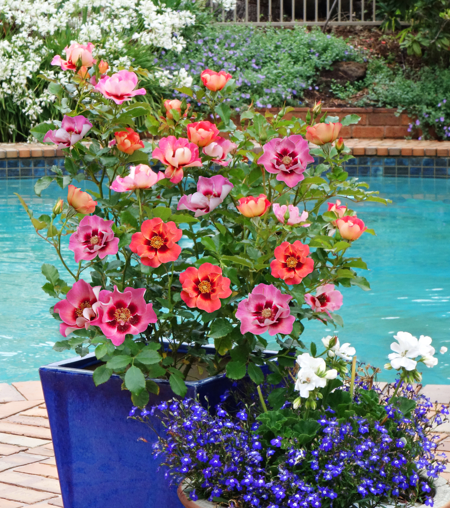
Limited on space? With it’s brilliant multi-colored blossoms, Sweet Spot™ Rose Calypso brings Pantone’s Flame, Pink Yarrow, Pale Dogwood and Primrose Yellow together in one magnificent plant. Small enough to work nicely in deck containers, the multi-hued Sweet Spot Decorator Rose™ Calypso colors really pop when planted in a Lapis Blue container.
According to the folks at Pantone, “Flame, is gregarious and fun loving. Flamboyant and vivacious, this wonderfully theatrical shade adds fiery heat to the spring 2017 palette.” If you enjoy bright colors, Tropicanna canna certainly fits the bill with its multi-striped, orange and green foliage and bright red-orange blossoms. Whether planted in rooftop garden containers or simple garden beds, Tropicanna brings an exotic touch to any space. Interplant Tropicanna with bright red-orange sun-tolerant Bonfire® begonia and you’ll really have a sizzling combination – one that brings in at least half of this year’s Pantone colors!
Looking for something a little more subtle? New Thunder Storm™ agapanthus’ variegated soft Kale green and white foliage serves as the perfect complementary background to its intense Lapis Blue blossoms. Planted along a walkway or as a border plant, easy-care Thunder Storm™ adds texture and color to any setting and also works as a fire retardent.
And finally, Pantone describes its Pale Dogwood as “a quiet and peaceful pink shade that engenders an aura of innocence and purity. The unobtrusive Pale Dogwood is a subtle pink whose soft touch infuses a healthy glow.” If you'd like to infuse your senses with not only this lovely calming color each spring, but a also soft gentle fragrance, plant a Fairy Magnolia near a porch or open window. Growing to only 5-7 feet wide and 9-12 feet high, this sweet little shrub has lovely Hazelnut buds that open to a fragrant soft pink petals each spring. It’s ideal as a specimen plant in small gardens and containers, espaliered or as a hedge in larger landscapes. Regardless of how you use it, this free-flowering beauty will add a peaceful touch to any space.
However you choose to use the Pantone Color Institute’s Top 10 picks for spring 2017, just spend a little time outdoors and you’re sure to find plenty of inspiration.
For more details on Pantone Color Institute’s selections for 2017 and why each color was chosen, click here.
For more hi-res photos to accompany this story starter, please contact Judie Brower at jbrower@TesselaarUSA.com
Looking for more fresh ideas, free images or story starters? Please visit our Newsroom.
To unsubscribe to Tesselaar's Story Starter emails, please reply to this email asking to unsubscribe. Thank you.
# # #
| Printer-friendly |
|
|
©2016 For more information contact: (203) 846-2811 or e-mail us. Like this release? Tell us what you think. |